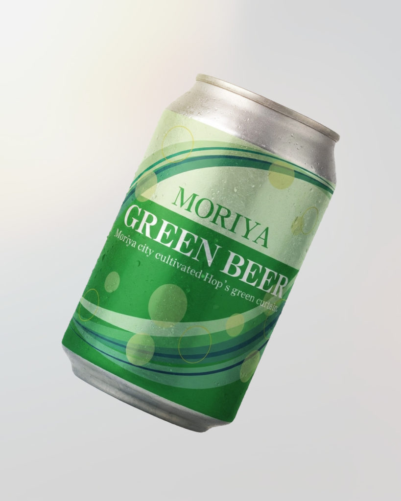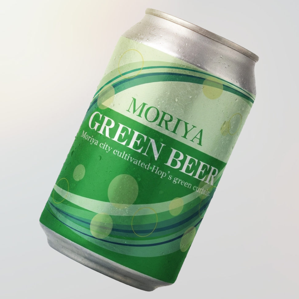
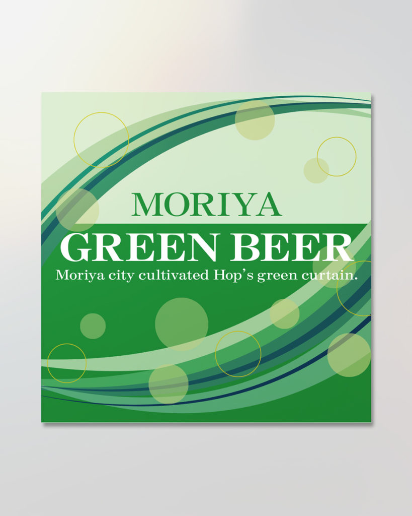
守谷市市制施行20周年記念ビールラベルデザイン募集に応募した作品。
20周年の節目に吹く新たな風と、グラスに注いだときのシュワシュワとした躍動感を、流れるような線と軽やかな円で表現。
文字はビールのラベルらしく、シックで落ち着いたタイポグラフィでまとめた。
A label design entry for the Moriya City 20th Anniversary Beer Label Design Competition. The flowing lines represent the breeze of a new era, while the scattered circles evoke the lively effervescence of beer — together capturing the celebratory spirit of the city’s milestone. The typography is set in a refined, classic style befitting a premium beer label.