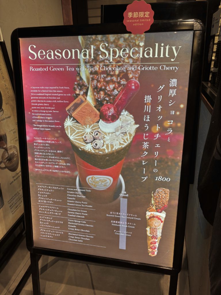
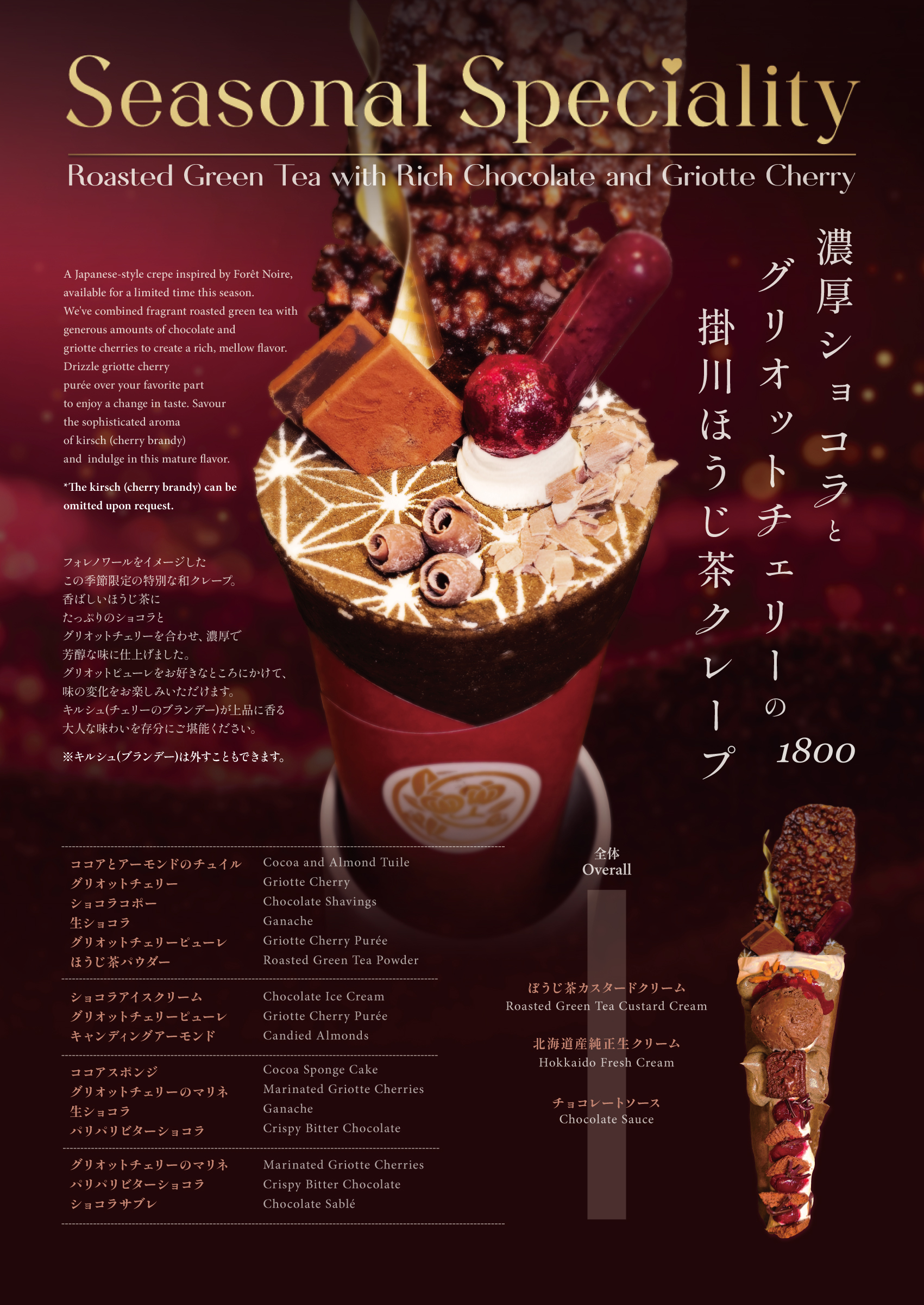
バレンタイン限定クレープ プロモーションポスター
高級和クレープ専門店の期間限定商品のためのポスターデザイン。
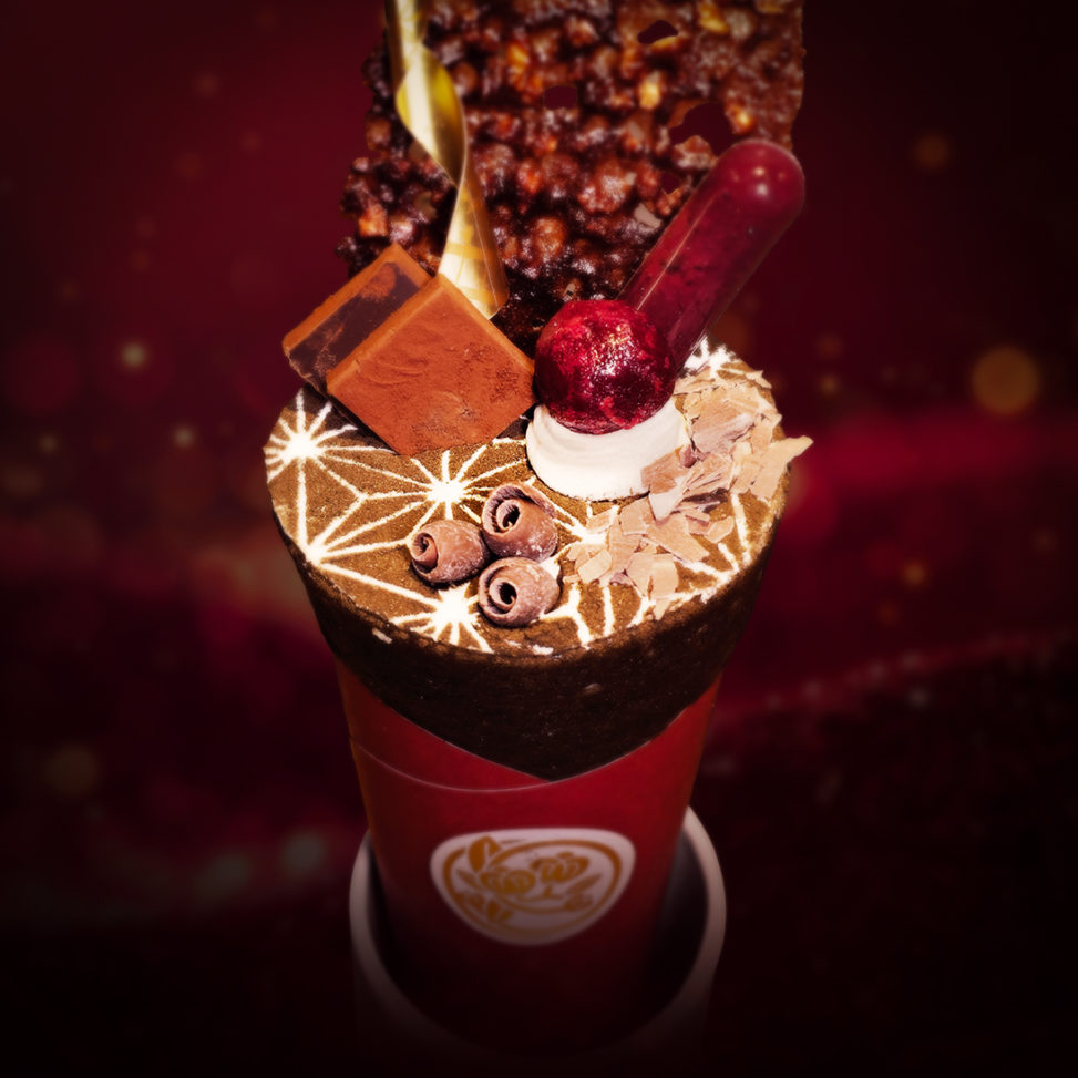
フォレノワールをインスピレーション源とし、ほうじ茶・濃厚なチョコレート・グリオットチェリーを組み合わせた和洋折衷の商品コンセプトを表現した。
赤い宇宙をイメージしたグラデーションときらめきのある背景にゴールドのタイポグラフィを配置し、ワインレッドのグリオットチェリーをアクセントカラーとして採用。高級フレンチレストランを想起させる洗練された色彩設計により、商品の特別感と贅沢さを視覚化している。
各構成要素(チュイル、チェリー、チョコレート等)を丁寧に明記することで、商品の価値を多層的に伝達する構成。日英バイリンガル表記により、国際的な顧客層にも対応。
タイトル「Seasonal Speciality」のIのドット部分をハートに置き換え、過度な装飾を避けながら遊び心を添えた。
クライアントからは「高級フレンチのデザイン」「本職の実力」との評価を得て、当初のバレンタイン期間から3月までの販売延長が決定。商業的成果にも貢献したデザインである。
Seasonal Japanese Crepe Promotional Poster
A poster design for a limited-time menu item at a premium Japanese crepe specialty shop. Inspired by Forêt Noire, the design expresses the fusion concept of roasted green tea, rich chocolate, and griotte cherries—a harmonious blend of Japanese and Western elements.
The color palette features a gradient background evoking a red cosmos with sparkling accents, paired with gold typography and wine-red griotte cherries as the accent color. This sophisticated color scheme, reminiscent of high-end French restaurants, visually communicates the product’s exclusivity and luxury.
By meticulously listing each component (tuile, cherries, chocolate, etc.), the design conveys the product’s value in multiple layers. Bilingual Japanese-English text accommodates an international clientele.
A subtle playful touch: the dot of the “I” in “Seasonal Speciality” is replaced with a heart, adding charm without excessive decoration. The client praised it as “high-end French design” and “professional-level work.”
Following this positive reception, the sales period was extended from the original Valentine’s season through March, demonstrating the design’s commercial impact.